TextField is often used for input in Flutter but we (at least I) run into a lot of problems to achieve what we want. I often forget how to do something. I hope this page helps you guys to find out the desired solution.
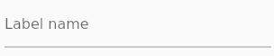
Add Label
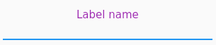
TextField itself doesn’t have label property but we can define it in decoration. InputDecoration class has label and labelText properties. Since label is basically text, set the desired string labelText.
TextField(
  decoration: InputDecoration(
    labelText: "Label name",
  ),
);
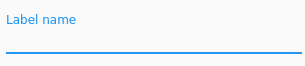
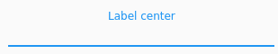
How to show label on center
If we want to show it in the center of the widget, set floatingLabelAlignment to FloatingLabelAlignment.center. The label is shown in the center when the widget has focus.
TextField(
  decoration: InputDecoration(
    labelText: "Label center",
    floatingLabelAlignment: FloatingLabelAlignment.center,
  ),
);
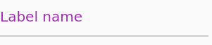
How to change label style
If the label needs to be bigger, set labelStyle to the desired style.
TextField(
  decoration: InputDecoration(
    labelText: "Label name",
    labelStyle: TextStyle(fontSize: 20, color: Colors.purple),
    floatingLabelAlignment: FloatingLabelAlignment.center,
  ),
);
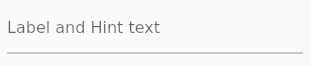
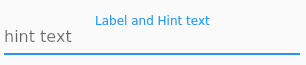
How to always show hint text and float the label on top
Label is normally shown in the content area. If hintText is set, the text is not shown until it has focus.
TextField(
  decoration: InputDecoration(
    floatingLabelAlignment: FloatingLabelAlignment.center,
    labelText: "Label and Hint text",
    hintText: "hint text",
  ),
);
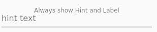
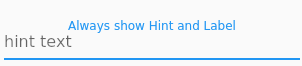
To show both label and hint text, floatingLabelBehavior needs to be set to FloatingLabelBehavior.always.
TextField(
  decoration: InputDecoration(
    floatingLabelAlignment: FloatingLabelAlignment.center,
    floatingLabelBehavior: FloatingLabelBehavior.always,
    labelText: "Always show Hint and Label",
    hintText: "hint text",
  ),
);
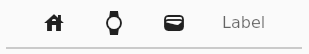
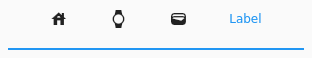
Use Icon or non text as Label
It’s also possible to use Icon for the label. InputDecoration has label property that requires a Widget. Therefore, we can set whatever we want here. An icon can be used but we can also add multiple widgets by using Row.
TextField(
  decoration: InputDecoration(
    label: Row(
      mainAxisAlignment: MainAxisAlignment.spaceEvenly,
      children: [
      Icon(Icons.house),
      Icon(Icons.watch),
      Icon(Icons.wallet),
      Text("Label"),
    ]),
  ),
);
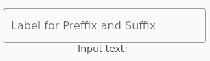
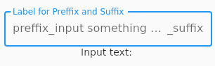
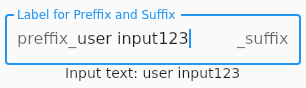
Adding preffix and suffix text
Prefix and suffix text can be easily added to TextField. The prefix and suffix are not added to the input text. So it’s useful if we want to show the fixed text to a user.
TextField(
  onChanged: (value) => setState(() {
    _inputText = value;
  }),
  decoration: InputDecoration(
    labelText: "Label for Preffix and Suffix",
    hintText: "input something here",
    prefixText: "preffix_",
    suffixText: "_suffix",
    border: const OutlineInputBorder(
      borderSide: BorderSide(width: 2, color: Colors.black),
    ),
  ),
);
Decoration
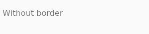
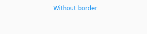
Without border
Set InputBorder.none to border property in InputDecoration if no border is needed. Define the label or hint text in this case because a user can’t recognize that there is a TextField there.
TextField(
  decoration: InputDecoration(
    floatingLabelAlignment: FloatingLabelAlignment.center,
    label: Text("Without border"),
    border: InputBorder.none,
  ),
);
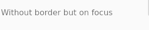
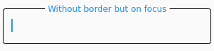
Border only on focus
We can add the border only when it has focus. focusedBorder is applied when the widget has focus.
TextField(
  decoration: InputDecoration(
    floatingLabelAlignment: FloatingLabelAlignment.center,
    label: Text("Without border but on focus"),
    border: InputBorder.none,
    focusedBorder: const OutlineInputBorder(
      borderSide: BorderSide(width: 1, color: Colors.black),
    ),
  ),
);
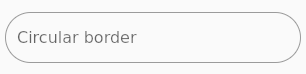
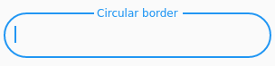
Rounded corner shape
Rounded corner can be defined by setting OutlineInputBorder.borderRadius. Be aware that the borderSide is ignored but only the shape definition is used.
TextField(
  decoration: InputDecoration(
    floatingLabelAlignment: FloatingLabelAlignment.center,
    label: Text("Circular border"),
    border: OutlineInputBorder(
      borderSide: BorderSide(width: 5, color: Colors.black), // ignored...
      borderRadius: BorderRadius.all(Radius.circular(40)),
    ),
  ),
);
If the borderRadius is not set, the shape will be a rectangle.
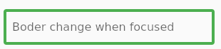
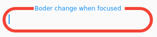
Change decoration shape and the color on focus
When the widget has focus, it’s better to change the color of the widget for a better user experience. We can achieve this by setting InputDecoration.focusedBorder. The color changes to red and the shape changes to rounded corners when it has focus.
TextField(
  decoration: InputDecoration(
    floatingLabelAlignment: FloatingLabelAlignment.center,
    label: Text("Boder change when focused"),
    enabledBorder: const OutlineInputBorder(
      borderSide: BorderSide(width: 4, color: Colors.green),
    ),
    focusedBorder: const OutlineInputBorder(
      borderSide: BorderSide(width: 6, color: Colors.red),
      borderRadius: BorderRadius.all(Radius.circular(40)),
    ),
  ),
);
We can use border property instead of enabledBorder if it’s not necessary to change the shape width and color when it doesn’t have focus.
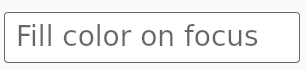
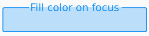
Change background color on focus
To change the color on focus, we need two additional variables. Firstly, we need to know that the widget has focus. We need to set FocusNode to the TextField. Then, we need to store the current color to a variable. The variable has to be updated when TextField has focus.
Let’s add two variables first and add a listener to change the color on focus. The callback for addListener is called when it gets/releases focus.
FocusNode _focusNode = FocusNode();
Color _filledColor = Colors.white;

@override
void initState() {
  _focusNode.addListener(() {
    if (_focusNode.hasFocus) {
      setState(() {
        _filledColor = Colors.blue.shade100;
      });
    } else {
      setState(() {
        _filledColor = Colors.white;
      });
    }
  });
  super.initState();
}

@override
void dispose() {
  _focusNode.dispose();
  super.dispose();
}
Once it’s ready, set the variables.
TextField(
  focusNode: _focusNode,
  decoration: InputDecoration(
    floatingLabelAlignment: FloatingLabelAlignment.center,
    label: Text(
      "Fill color on focus",
      style: TextStyle(fontSize: 28),
    ),
    border: const OutlineInputBorder(),
    filled: true,
    fillColor: _filledColor,
  ),
);
How to add icon
TextField with a suitable icon makes the user experience better. You know that a search icon is shown on a search bar.
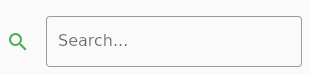
Add Icon to the left outside of the TextField
Let’s add a search icon to the left outside of the TextField.
TextField(
  decoration: InputDecoration(
    icon: Icon(Icons.search),
    iconColor: Colors.green,
    hintText: "Search...",
    border: const OutlineInputBorder(
      borderSide: BorderSide(width: 2, color: Colors.black),
    ),
  ),
);
But I don’t think this UI style is often seen.
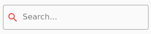
Add Icon to the left inside of the textField
I think this is the most often used UI style. The search icon is inside of the widget. The color of the icon can also be defined by IconColor.
TextField(
  decoration: InputDecoration(
    prefixIcon: Icon(Icons.search),
    prefixIconColor: Colors.red,
    hintText: "Search...",
    border: const OutlineInputBorder(
      borderSide: BorderSide(width: 2, color: Colors.black),
    ),
  ),
);
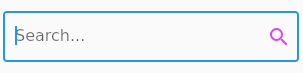
Add Icon to the right inside of the textField
If an icon needs to be located on the right side of the widget, define suffixIcon instead.
TextField(
  decoration: InputDecoration(
    suffixIcon: Icon(Icons.search),
    suffixIconColor: Colors.purpleAccent,
    hintText: "Search...",
    border: const OutlineInputBorder(
      borderSide: BorderSide(width: 2, color: Colors.black),
    ),
  ),
);
Input related
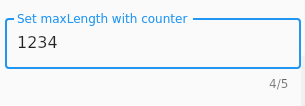
Define max length
We can set max length by defining maxLength. A user can’t input more than 5 characters.
TextField(
  maxLength: 5,
  decoration: InputDecoration(
    label: Text("Set maxLength with counter"),
    hintText: "Input something",
    border: const OutlineInputBorder(
      borderSide: BorderSide(width: 2, color: Colors.black),
    ),
  ),
);
When it’s defined, counter text is automatically shown at the bottom right.
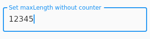
How to hide letter counter
It’s useful to show the counter for passwords for example. However, it’s not always the case. Set empty string to counterText to hide the counter.
TextField(
  maxLength: 5,
  decoration: InputDecoration(
    label: Text("Set maxLength without counter"),
    hintText: "Input something",
    counterText: "",
    border: const OutlineInputBorder(
      borderSide: BorderSide(width: 2, color: Colors.black),
    ),
  ),
);
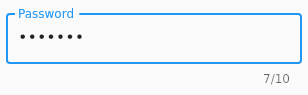
How to make the input invisible for password
If TextField is used for sensitive data, the string must not have to be shown.
Set true to obscureText in this case.
TextField(
  obscureText: true,
  maxLength: 10,
  decoration: InputDecoration(
    label: Text("Password"),
    hintText: "Input your password",
    border: const OutlineInputBorder(
      borderSide: BorderSide(width: 2, color: Colors.black),
    ),
  ),
);
How to validate password
Validation logic can be implemented onChanged if the value needs to be validated during the input.
Define onSubmitted instead if it’s enough to validate it when a user completes the input.
String? _errorText = null;

TextField(
  maxLength: 10,
  onChanged: (value) {
    // Requirement
    // at least one lower case
    // at least one upper case
    // at least one number
    // at least one special character
    // length must be 5 or bigger
    final regex = RegExp("^(?=.*[a-z])(?=.*[A-Z])(?=.*[0-9])(?=.*[!@#\$%&*]).{5,}"
    if (!value.isEmpty && !regex.hasMatch(value)) {
      setState(() {
        _errorText = "invalid password";
      });
    } else {
      setState(() {
        _errorText = null;
      });
    }
  },
  decoration: InputDecoration(
    label: Text("Password"),
    hintText: "Input your password",
    border: const OutlineInputBorder(
      borderSide: BorderSide(width: 2, color: Colors.black),
    ),
    errorBorder: const OutlineInputBorder(
      borderSide: BorderSide(width: 3, color: Colors.red),
    ),
    errorText: _errorText,
  ),
);
errorBorder is used for the UI
if errorText is not null. The TextField is shown with a red rectangle and the error text is shown at the bottom right when the password doesn’t fulfill the requirement.
Allow only number and add a space automatically for Credit Card info
There are many cases where only number is allowed to be input. To allow number only, the following two settings are needed.
keyboardType: TextInputType.number,
inputFormatters: [
  FilteringTextInputFormatter.digitsOnly,
],
Defining keyboardType is not enough because a user might use copy/paste. Non-number value can be given in this case. That’s why FilteringTextInputFormatter.digitsOnly needs to be defined too.
This is the first step. The second step is to add a space every 4 characters. It can be implemented in a custom formatter.
TextField(
  maxLength: 19, // 4 * 4 + 3 spaces
  keyboardType: TextInputType.number,
  inputFormatters: [
    FilteringTextInputFormatter.digitsOnly,
    CardNumberFormatter(), // custom formatter
  ],
  onChanged: (value) {},
  decoration: InputDecoration(
    prefixIcon: Icon(Icons.credit_card),
    labelText: "Credit Card Number",
    hintText: "XXXX XXXX XXXX XXXX",
    border: const OutlineInputBorder(
      borderSide: BorderSide(width: 2, color: Colors.black),
    ),
  ),
);
A custom formatter must extend TextInputFormatter. The main logic is in the for loop.
class CardNumberFormatter extends TextInputFormatter {
  @override
  TextEditingValue formatEditUpdate(
    TextEditingValue previousValue,
    TextEditingValue nextValue,
  ) {
    String result = "";

    for (int i = 0; i < nextValue.text.length; i++) {
      result += nextValue.text[i];
      final indexFromOne = i + 1;
      if (indexFromOne % 4 == 0 && indexFromOne != nextValue.text.length) {
        result += " ";
      }
    }

    return nextValue.copyWith(
      text: result,
      selection: TextSelection.collapsed(
        offset: result.length,
      ),
    );
  }
}
The condition indexFromOne != nextValue.text.length is for deleting text because the space has to be deleted.
Note that the cursor moves to the end if you input/delete in the middle. This is because selection is set with offset in the formatted. It might look a bit strange but I think it’s acceptable.
Adapt the height depending on the number of lines
It’s possible to input multilines but maxLines is set to 1 by default. Set to null to maxLines and set TextInputAction.newline to textInputAction.
TextField(
  textInputAction: TextInputAction.newline,
  maxLines: null,
  decoration: InputDecoration(
    labelText: "Multilines",
    border: const OutlineInputBorder(
      borderSide: BorderSide(width: 2, color: Colors.black),
    ),
  ),
);
The widget’s height is for a single line at first, but the height gets bigger when a user inputs multiple lines.
If the height needs to be fixed, set the desired lines to maxLines.
TextField(
  keyboardType: TextInputType.multiline,
  maxLines: 3, // display only for 3 lines but not limit the number of lines
  decoration: InputDecoration(
    labelText: "Max 3 lines",
    border: const OutlineInputBorder(
      borderSide: BorderSide(width: 2, color: Colors.black),
    ),
  ),
);
It always shows 3 lines but a user can input more lines.
TextField in Row
TextField can’t be used in Row without defining the width. The following error occurs without width.
The following assertion was thrown during performLayout():
An InputDecorator, which is typically created by a TextField, cannot have an unbounded width.
This happens when the parent widget does not provide a finite width constraint. For example, if the
InputDecorator is contained by a Row, then its width must be constrained. An Expanded widget or a
SizedBox can be used to constrain the width of the InputDecorator or the TextField that contains it.
'package:flutter/src/material/input_decorator.dart':
Failed assertion: line 938 pos 7: 'layoutConstraints.maxWidth < double.infinity'
As written in the error message, the solution is to define width. Use SizedBox, Expanded, or Flexible for example.
Row(
  children: [
    SizedBox(
      child: TextField(),
      width: 50,
    )
  ],
),
Row(
  children: [
    Expanded(
      child: TextField(),
      flex: 2,
    ),
  ],
),
Move the cursor to the next widget when input is completed
If there are multiple fields to input, the cursor should be moved to the next field when a user presses enter. The default behavior of completion is to unfocuse the widget and nothing more. How can we implement to move the cursor?
It’s easy to do it. Define the following property.
textInputAction: TextInputAction.next,The cursor moves to the next focusable widget. See the following example. Three TextField are defined in a Row. The cursor moves to the next when a user completes inputting the first two fields.
But the cursor shouldn’t be moved for the last one. Instead, it should just unfocus. Set TextInputAction.done in this case.
Row(
  children: [
    Flexible(
      flex: 1,
      child: TextField(
        textInputAction: TextInputAction.next,
        decoration: InputDecoration(
          labelText: "Input A",
          border: const OutlineInputBorder(
            borderSide: BorderSide(width: 2, color: Colors.black),
          ),
        ),
      ),
    ),
    Flexible(
      flex: 1,
      child: Padding(
        padding: EdgeInsets.only(right: 5, left: 5),
        child: TextField(
          textInputAction: TextInputAction.next,
          decoration: InputDecoration(
            labelText: "Input B",
            border: const OutlineInputBorder(
              borderSide: BorderSide(width: 2, color: Colors.black),
            ),
          ),
        ),
      ),
    ),
    Flexible(
      flex: 1,
      child: TextField(
        textInputAction: TextInputAction.done,
        decoration: InputDecoration(
          labelText: "Input C",
          border: const OutlineInputBorder(
            borderSide: BorderSide(width: 2, color: Colors.black),
          ),
        ),
      ),
    ),
  ],
);
Consider to use FocusNode instead if this implementation doesn’t fit to your implementation. The cursor can be moved wherever you want with the following code.
FocusScope.of(context).requestFocus(focusNode);The example is described in the following post. Please check it for more details.

Comments