I wanted to show a graph for my application, so I looked for some tools and found a great tool called fl_chart. I tried to use Line Chart functionality, so I will share what I did in this post.
Generate random data for the chart
I want to show Google Search Console data in my app, so I created a class that has the date and the corresponding value. The data is random values in the range 0 to 10,000.
class _MyData {
  final DateTime date;
  final double value;

  _MyData({
    required this.date,
    required this.value,
  });
}

List<_MyData> _generateData(int max) {
  final random = new Random();

  return List.generate(
    31,
    (index) => _MyData(
      date: DateTime(2022, 1, index + 1),
      value: random.nextDouble() * max,
    ),
  );
}

class Graph extends StatefulWidget {
  @override
  _Graph createState() => _Graph();
}

class _Graph extends State<Graph> {
  late List<_MyData> _data;

  @override
  void initState() {
    _data = _generateData(10000);
    super.initState();
  }
}
If you want to generate random values in a certain range, the following post might be helpful.

Hold a place to show the chart
The next step is to hold the place to show the chart. Fl_chart shows axis titles by default.
@override
Widget build(BuildContext context) {
  return SafeArea(
    child: Scaffold(
      appBar: AppBar(
        title: Text("Graph sample"),
      ),
      body: Center(
        child: Container(
          decoration: BoxDecoration(
            border: Border.all(),
          ),
          child: _graph(),
          margin: EdgeInsets.all(3),
          padding: EdgeInsets.all(15),
          height: MediaQuery.of(context).size.height * 0.5,
        ),
      ),
    ),
  );
}
Without the padding, the axis title is rendered over the parent widget.
Minimal code for a chart
Let’s check the default behavior. This time, we will use a line chart. Random values are assigned to _data variable in initState shown the code above.
Widget _graph() {
  final spots = _data
      .asMap()
      .entries
      .map((element) => FlSpot(
            element.key.toDouble(),
            element.value.value,
          ))
      .toList();

  return LineChart(
    LineChartData(
      lineBarsData: [
        LineChartBarData(
          spots: spots,
        ),
      ],
    ),
    swapAnimationDuration: Duration(milliseconds: 150), // Optional
    swapAnimationCurve: Curves.linear, // Optional
  );
}
By the way, the values of swapAnimationDuration and swapAnimationCurve are default values. If we want to change the chart style, we can change it.
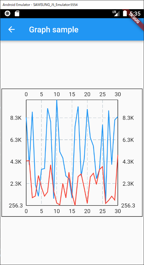
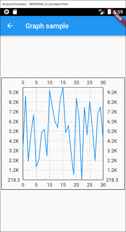
Wow. With this minimal code, a chart is shown! Detailed data is also shown when touching the area. What great this is.
But one thing we should be careful of is that the detailed information is shown in the data above. If the data is on top of the widget, the widget is rendered outside of the screen.
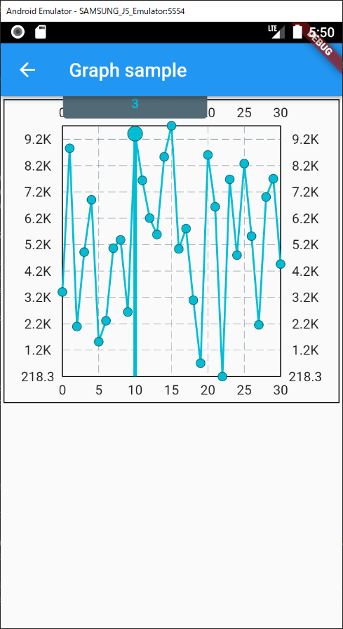
Not show the dot for the each data
If the screen is small like on a mobile, the dots might be annoying. In this case, we can disable it. Let’s change the line color as well.
return LineChart(
  LineChartData(
    lineBarsData: [
      LineChartBarData(
        spots: spots,
        dotData: FlDotData(show: false),
        colors: const [Colors.blue],
      ),
      ...
    ]
  ),
);
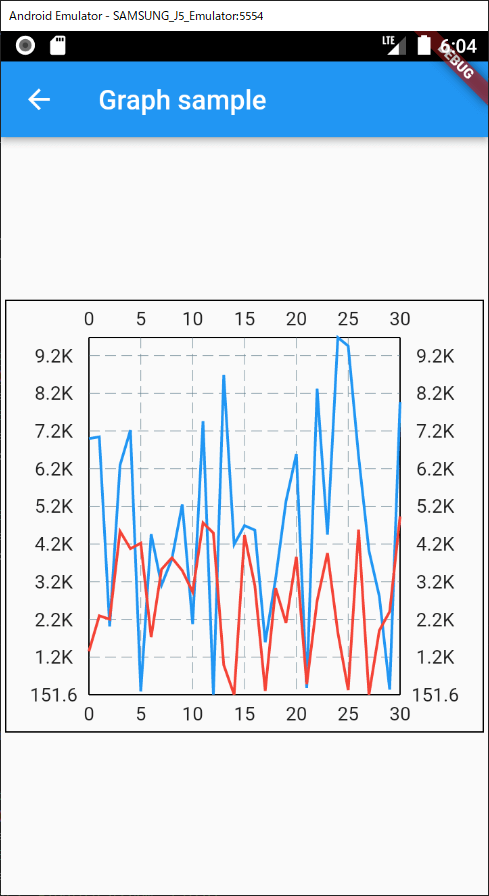
Add the second line
It’ ‘s easy to add the second line. Just add an additional LineChartBarData.
final spots2 = _generateData(5000)
    .asMap()
    .entries
    .map(
      (element) => FlSpot(
        element.key.toDouble(),
        element.value.value,
      ),
    )
    .toList();

return LineChart(
  LineChartData(
    lineBarsData: [
      LineChartBarData(
        spots: spots,
        dotData: FlDotData(show: false),
        colors: const [Colors.blue],
      ),
      LineChartBarData(
        spots: spots2,
        dotData: FlDotData(show: false),
        colors: const [Colors.red],
      ),
    ],
    ...
  ),
);
Define axis titles
If the two lines are for the same indicator, it’s not necessary to show the title both left and right. Let’s hide the unnecessary titles and try to change the bottom title to date.
return LineChart(
  LineChartData(
    lineBarsData: [...],
    titlesData: FlTitlesData(
      rightTitles: SideTitles(showTitles: false),
      topTitles: SideTitles(showTitles: false),
      bottomTitles: SideTitles(
        reservedSize: 6,
        getTextStyles: (context, xValue) => const TextStyle(
          color: Colors.pink,
          fontSize: 9,
        ),
        rotateAngle: 30,
        showTitles: true,
        getTitles: (xValue) {
          final date = _data[xValue.toInt()].date;
          return DateFormat.MMMd().format(date);
        },
      ),
    ),
  ),
  ...
);
When the date is shown without an angle, the string overlaps. To show the date here, it should be short enough. The format is done by DateFormat. If you are not familiar with it, please check the following post as well.
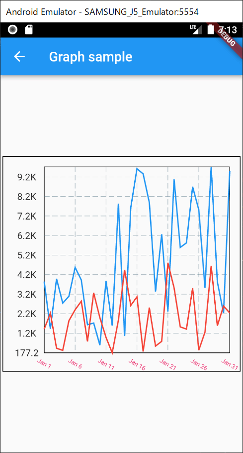
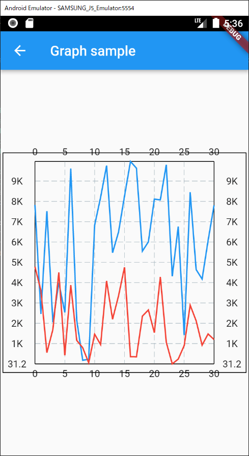
Chart is rendered over the parent widget
LineChartData offers minY and maxY properties. If we add those properties without thinking about the chart data, the chart is rendered over the parent widget.
return LineChart(
  LineChartData(
    ...
    clipData: FlClipData.all(),
    minY: 3000,
    maxY: _data.map((e) => e.value).reduce(max),
  ),
);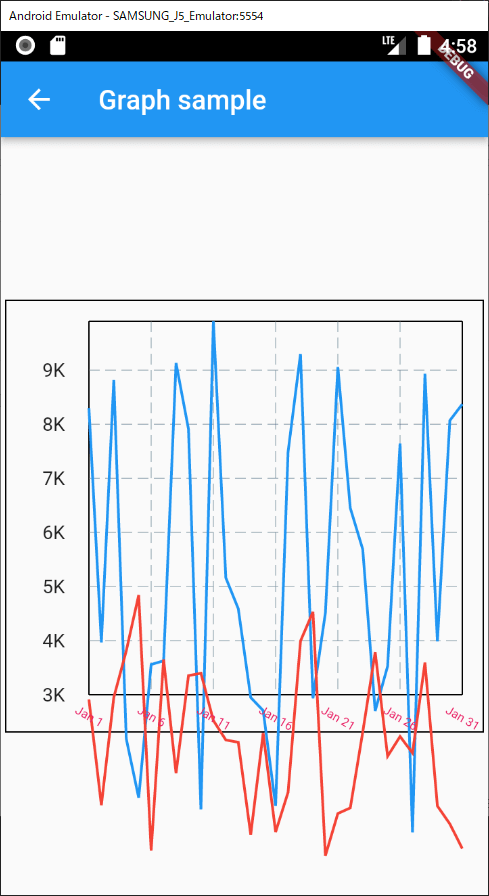
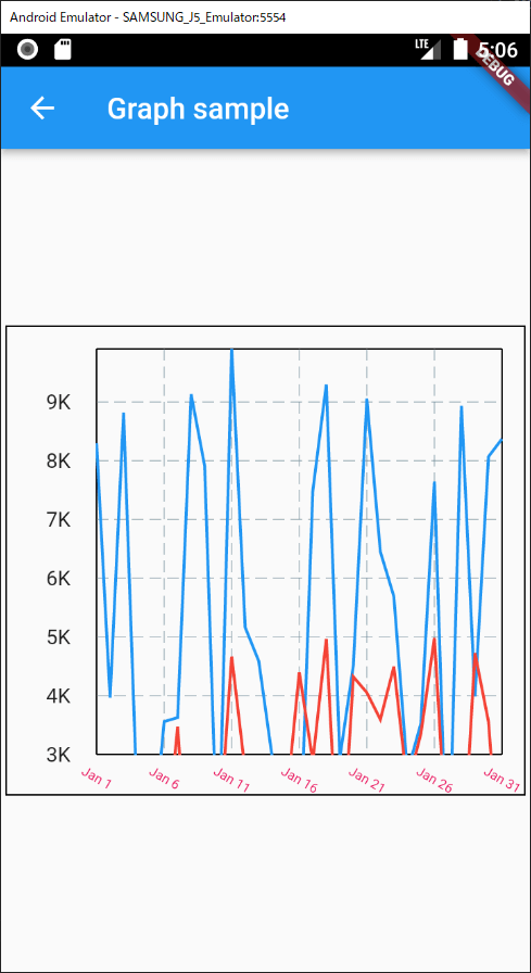
To avoid this problem, clipData property needs to be set.
return LineChart(
  LineChartData(
    ...
    clipData: FlClipData.all(), // add here
    minY: 3000,
    maxY: _data.map((e) => e.value).reduce(max),
  ),
);
Make the chart scrollable
If the screen is too small to show the chart, it should be scrollable. To make it scrollable, we can use SingleChildScrollView.
Widget _scrollGraph() {
  return SingleChildScrollView(
    scrollDirection: Axis.horizontal,
    child: Container(
      padding: EdgeInsets.only(bottom: 15),
      width: MediaQuery.of(context).size.height * 2,
      child: _graph(),
    ),
  );
}
If you need to make it scrollable in bi directions, in other words, cross-axis, the following post might be helpful.
Comments