PageView can handle multiple views on the same screen but I didn’t find an easy way to show an indicator that shows where the current view is. Some modules do it for us but let’s do the same thing by TabBar because less number of dependencies is better.
Word definitions in this post.
- View – contents shown in the TabBarView
- Page – A widget that defines multiple TabBarView
- Screen – A screen of the Android emulator
What we want to achieve
We have 3 views for all examples in this post. Each view has a number text in the center of it. This is the code for it.
final views = List.generate(
  3,
  (index) => Scaffold(
    appBar: AppBar(
      title: Text("View ${index + 1}"),
    ),
    body: Center(
      child: Text(
        "${index + 1}",
        style: TextStyle(fontSize: 50),
      ),
    ),
  ),
);
Each of them has a view title on AppBar. There might be different icons on the AppBar for each view in a real application. We want to move between those views by swiping and show an indicator that shows where the current view is.
We can of course set bottomNavigationBar if we want to show it at the bottom but if we want to show it at the top of the view, we need a different way.
DefaultTabController and TabBarView with TabBar in AppBar
To show an indicator, we can use TabBarView and TabBar. TabBarView requires a controller but if it is not necessary to have a special controller we need to wrap it by DefaultTabController like this.
DefaultTabController(length: views.length, child: _child1(views)),We need to specify the number of pages and a child that contains TabBarView. The code for TabBarView is the following.
Widget _child1(List<Widget> views) {
return Scaffold(
body: TabBarView(
children: views,
),
appBar: AppBar(
title: const Text("App Title"),
bottom: _tabBar1(),
),
);
}
TabBar _tabBar1() {
return const TabBar(
tabs: [
Text("View 1"),
Text("View 2"),
Text("View 3"),
],
indicatorWeight: 5.0,
);
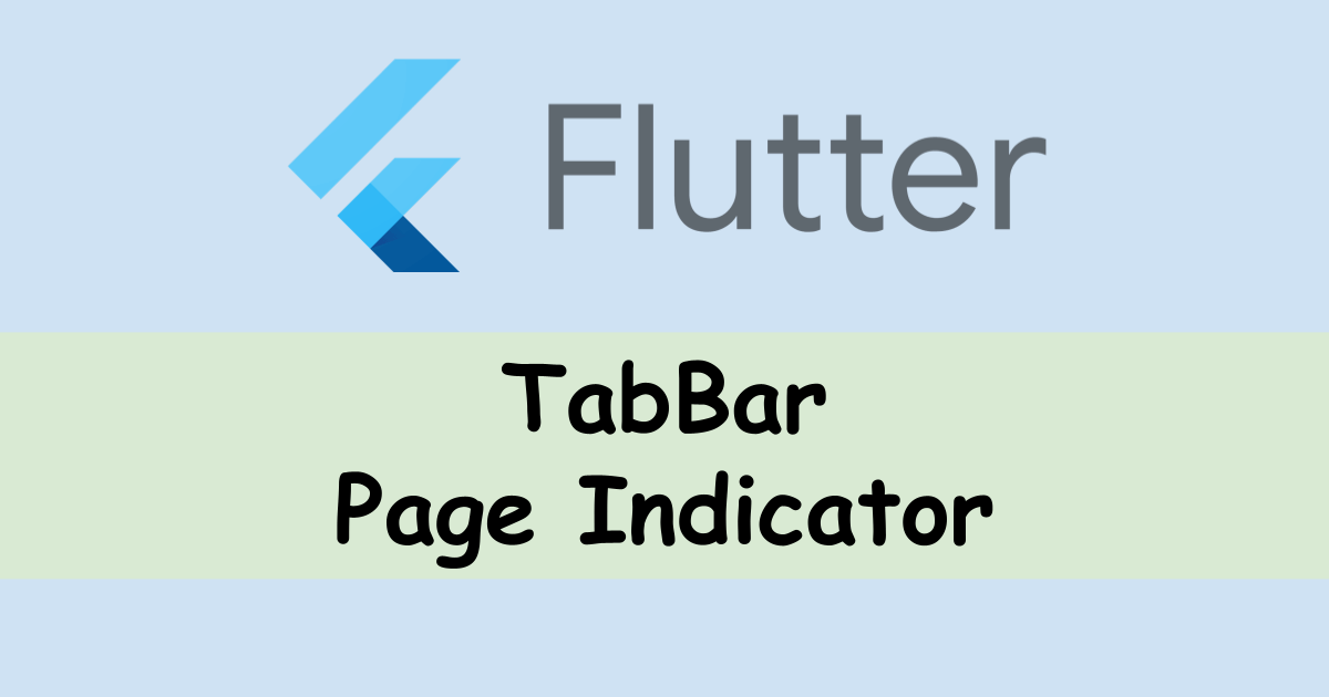
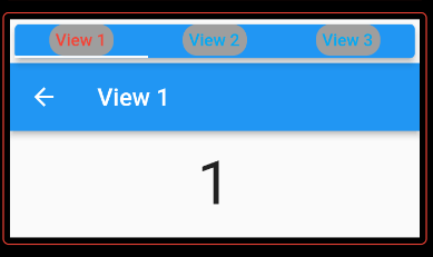
}I placed all examples on the same page. Each box has 1/3 of the screen height. A box at the top of the page is the result of the code above.
We can move between the pages by either swipe or pressing the target tab. However, AppBar of the page is actually unnecessary because each page has its own title.
By the way, the default value of indicatorWeight is 2.0.
If we delete the title in the AppBar, it looks like this.
DefaultTabController(length: views.length, child: _child2(views)),
...

Widget _child2(List<Widget> views) {
  return Scaffold(
    body: TabBarView(
      children: views,
    ),
    appBar: AppBar(
      // title is deleted here
      bottom: _tabBar1(),
    ),
  );
}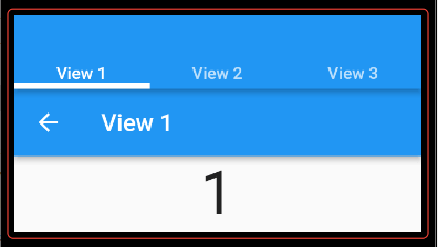
The title is not there but it still owns the space!
TabBar with labels without AppBar
The default height of AppBar is 56.0. If we set toolbarHeight property, we can remove the space but we need to adjust the height if we want to change the tab label size. It’s not good. Instead, we can use PreferredSize widget. Since TabBar has preferredSize, we should use it to decide the height.
DefaultTabController(
  length: views.length,
  child: _child3(context, views, _tabBar1()),
),
...

Widget _child3(BuildContext context, List<Widget> views, TabBar tabBar) {
  return Scaffold(
    body: TabBarView(
      children: views,
    ),
    appBar: PreferredSize(
      preferredSize: tabBar.preferredSize,
      child: Card(
        elevation: 5.0,
        color: Theme.of(context).primaryColor,
        child: tabBar,
      ),
    ),
  );
}
Yes! The space has gone somewhere. But, why do we set Card to the child property? Let’s see the result without it.
Oh, labels are invisible. If we set a color to the Text widget, it will probably be visible.
TabBar without labels
Are the labels necessary? If so, keep the implementation. If not, let’s check another way. We need to set the same number of widgets into TabBar.tabs as the number of the views but we don’t want to have the labels. Then, we need to set an empty widget there. Let’s set SizedBox.shrink() there.
DefaultTabController(
length: views.length,
child: _child3(context, views, _tabBar2()),
),
...
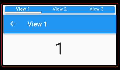
TabBar _tabBar2() {
return TabBar(
tabs: [
SizedBox.shrink(),
SizedBox.shrink(),
SizedBox.shrink(),
],
indicatorWeight: 5.0,
automaticIndicatorColorAdjustment: true,
indicatorColor: Colors.black,
);
}
It shows where the current view is but it doesn’t show how many views there are.
TabBar with custom box
Let’s go back one step. The problem in the previous example is that the labels are on the same line without separation. Let’s try to create a box for the labels to separate them.
DefaultTabController(
  length: views.length,
  child: _child3(context, views, _tabBar3()),
),
...

TabBar _tabBar3() {
  return TabBar(
    tabs: [
      for (int i = 0; i < 3; i++)
        Container(
          child: Text("View ${i + 1}"),
          padding: const EdgeInsets.symmetric(vertical: 5, horizontal: 5),
          decoration: BoxDecoration(
            borderRadius: BorderRadius.circular(12),
            color: Colors.grey,
          ),
        )
    ],
    labelColor: Colors.red,
    unselectedLabelColor: Colors.lightBlue,
    indicatorColor: Colors.blue,
  );
}
Choose preferred colors for each property.
If we prepare a box for a label, we no longer need a card for the tab bar. Let’s remove it.
DefaultTabController(
  length: views.length,
  child: _child4(context, views, _tabBar3()),
),
...

Widget _child4(BuildContext context, List<Widget> views, TabBar tabBar) {
  return Scaffold(
    body: TabBarView(
      children: views,
    ),
    appBar: PreferredSize(
      preferredSize: tabBar.preferredSize,
      child: tabBar,
    ),
  );
}
The highlighted color follows the view but the box color doesn’t change.
TabBar with custom box and change the color
To change the color of the selected label’s box, we need AnimateBuilder which requires a controller. It means that DefaultTabController is no longer necessary. Firstly, let’s define the controller.
class _MyTabbar extends State<MyTabbar> with SingleTickerProviderStateMixin {
  late TabController _controller;
  @override
  void initState() {
    _controller = TabController(length: 3, vsync: this, initialIndex: 0);
    super.initState();
  }

  @override
  void dispose() {
    _controller.dispose();
    super.dispose();
  }
...
}
Then, use the controller to get the current position.
TabBar _tabBar4() {
  return TabBar(
    controller: _controller,
    tabs: [
      for (int i = 0; i < 3; i++)
        AnimatedBuilder(
          animation: _controller.animation!,
          builder: (context, widget) {
            return Container(
              child: Text("View ${i + 1}"),
              padding: const EdgeInsets.symmetric(vertical: 5, horizontal: 5),
              decoration: BoxDecoration(
                borderRadius: BorderRadius.circular(12),
                // Use controller index here to know where the current position is.
                color: _controller.index == i ? Colors.black : Colors.grey,
              ),
            );
          },
        )
    ],
  );
}
The color follows the view switch but it is a bit slow and a bit strange. If the swipe is long-range, View1 is highlighted. If label text is not necessary, set SizedBox.shrink() to the child.
TabPageSelector instead of TabBar for no label indicator
We actually don’t need to implement the code above if we don’t need a label text.
Widget _child5(BuildContext context, List<Widget> views) {
  return Scaffold(
    body: TabBarView(
      controller: _controller,
      children: views,
    ),
    appBar: PreferredSize(
      preferredSize: Size.fromHeight(30),
      child: _tabPageSelector(),
    ),
  );
}
Widget _tabPageSelector() {
  return Center(
    child: TabPageSelector(
      controller: _controller,
      color: Colors.grey,
      selectedColor: Colors.purple,
      indicatorSize: 20,
    ),
  );
}
It works but the view doesn’t move even if I press one of the indicators.
End
If there are many views, TabBar might be a better choice for UX. Otherwise, choose TabPageSelector because it is a simple implementation.
If you need a complete code, you can find it here.
https://github.com/yuto-yuto/flutter_samples/blob/main/lib/tabbar.dart
Comments