Some audio players have a feature to repeat a specific area. The function seems to be called AB repeat or A-B repeat function.
slider is used to show where the current position is and how long the audio is. I wanted to specify the area to repeat the selected area.
Flutter offers RangeSlider that has two cursors (is it called a cursor?) but AB repeat feature needs 3 to show the following things.
- Audio Current position
- Start position of AB repeat
- End position of AB repeat
I will share the way since I implemented it in my flutter sample project. If you try to play with it, go to my Flutter sample project.
Place a widget on the same area to show the selected area
Firstly, we somehow need to show the selected area on a slider widget but Slider widget doesn’t have such a feature. So, we need to put another widget there. To put multiple widgets in the same area, we can use Stack widget. Let’s check the code.
final stack = Stack(
  children: [
    Positioned(
      top: 10,
      left: leftGlobalX,
      child: ColoredBox(
        color: Theme.of(context).primaryColor.withOpacity(0.5),
        child: SizedBox(
          height: 30,
          width: selectedAreaWidth ?? 10,
        ),
      ),
    ),
    slider,
  ],
);
In stack, Positioned widget is used to determine where to put a widget. We can control the position precisely with it. The position value is the relative position of the parent object. We need to determine only the left position to show the start position of AB repeat area. top is also defined here just because of adjusting the appearance.
It has a ColoredBox to show the selected area. It is placed in a specific area. Then, a slider widget is on it. It is important to put the slider widget after the ColoredBox widget. If the order is opposite, we can’t grab/move the slider position on the selected area.
Necessary items to show the area
What items do we need to show the area? It’s basically only the following two.
- Start position of the area
- End position of the area
Then, width of the area is end position – start position. However, the value of the slider is double and relative value. It can be set to value property.
double sliderPosition = 0;

@override
Widget build(BuildContext context) {
  ...
  final slider = Slider(
    onChanged: (double v) {
      setState(() {
        sliderPosition = v;
      });
    },
    value: sliderPosition,
  );
  ...
The range of the value is 0 – 1. So, it’s not possible to get the start/end global position without calculation.
Considering this, what we need are…
- Start relative position of the area on the slider
- End relative position of the area on the slider
- Start global position of the area on the slider
- End global position of the area on the slider
- Width of the slider
The width of the area can be calculated only with start/end relative positions and the width of the slider. However, we need to set value to Positioned widget to put the start position.
In this example, the width of the slider is not fixed. It changes depending on the size of the window. We need to know how to get the position and the width of the slider. Check the following post if you want to know how to do it in detail.
technicalfeeder.com/2023/02/flutter-how-to-get-widget-height-width-x-and-y-position/
Set start position and the area width
Let’s consider how many cases we need to handle.
- No End position
- Set start position
- Unset start position if the button is pressed twice on the same position
- End position exists
- Start position is bigger than end position
- Unset start position
- Unset start position if the button is pressed twice on the same position
- Start position is smaller than end position
- Set start position
- Start position is bigger than end position
We need to handle all cases above. Let’s see the basic implementation of the TextButton for A. If we implement the cases above, the code will look like the following.
TextButton(
  child: generateBorderedText("A"),
  onPressed: () => setState(() {
    if (endRelativePosition == null) {
      if (startRelativePosition == sliderPosition) {
        setState(() {});
      } else {
        setState(() {});
      }
      return;
    }

    if (endRelativePosition! <= sliderPosition) {
      if (startRelativePosition != null) {
        setState(() {});
      }
      return;
    }

    if (startRelativePosition == sliderPosition) {
      setState(() {});
      return;
    }

    if (endRelativePosition! > sliderPosition) {
      setState(() {});
    }
  }),
),
! is not needed if you use else or make the order opposite which means that non-null case is written first. It’s up to you.
The following 3 variables need to be updated in all places.
- startRelativePosition
- leftGlobalX
- selectedAreaWidth
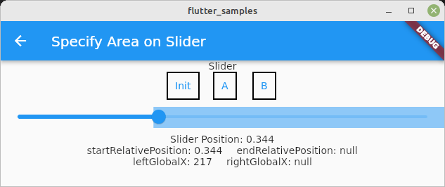
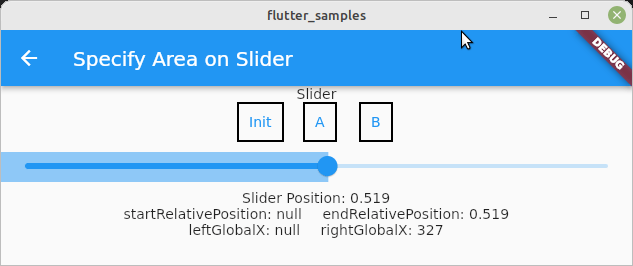
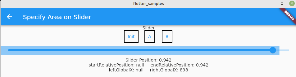
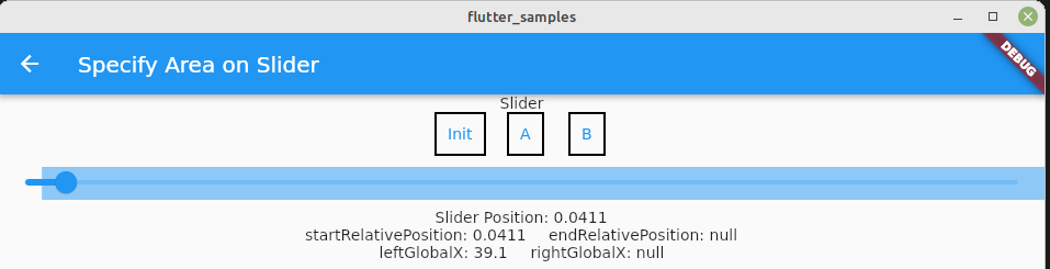
When end position is not set
Let’s check the case when end position is not set.
TextButton(
  child: generateBorderedText("A"),
  onPressed: () => setState(() {
    if (endRelativePosition == null) {
      if (startRelativePosition == sliderPosition) {
        setState(() {
          startRelativePosition = null;
          leftGlobalX = null;
          selectedAreaWidth = null;
        });
      } else {
        setState(() {
          startRelativePosition = sliderPosition;
          leftGlobalX = sliderWidth * sliderPosition;
          selectedAreaWidth = sliderWidth * (1 - sliderPosition);
        });
      }
      return;
    }
All variables need to be set null to unset. It’s clear.
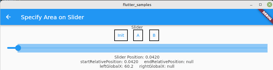
startRelativePosition is the current position of the slider position. We can use sliderPosition value because it’s set to value property of slider widget.
Since the slider starts from the left edge of the window, we can calculate leftGlobalX by sliderWidth * sliderPosition Slider position is relative. So this formula results for example 500 * 0.2 = 100. If the slider widget is used in another widget, add the dx position of the slider widget.
The slider width is dynamic but it can be read in the following way.
double get sliderWidth {
  final renderBox = keyForSlider.currentContext?.findRenderObject() as RenderBox;
  return renderBox.size.width;
}
Check the following post if you need to know the detail.
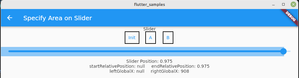
When the start position is set, ColoredBox needs to be filled between the start position and the end of the slider. That’s why calculating (1 - sliderPosition).
The result is the following.
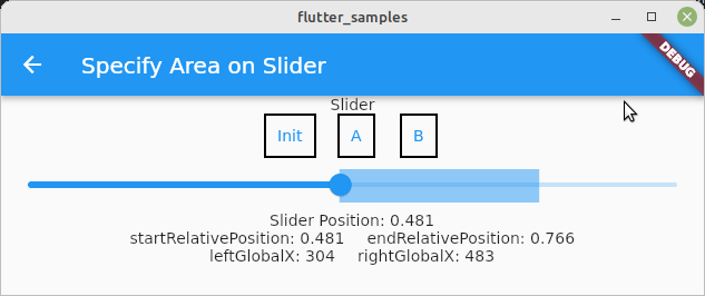
When end position is set
When start position is bigger than end position
In this case, unset the start position but we need to be cafule with the width. When it is unset, the width needs to be changed because the area needs to be between slider start position and the end position.
TextButton(
  child: generateBorderedText("A"),
  onPressed: () => setState(() {
    ...

    if (endRelativePosition! <= sliderPosition) {
      if (startRelativePosition != null) {
        setState(() {
          startRelativePosition = null;
          leftGlobalX = null;
          selectedAreaWidth = rightGlobalX!;
        });
      }
      return;
    }

    ...
  }),
),
The width of the area is the same as end global position.
When the button is pressed twice on the same position
We want to unset the start position but the width of the area needs to be adjusted.
TextButton(
  child: generateBorderedText("A"),
  onPressed: () => setState(() {
    ...

    if (startRelativePosition == sliderPosition) {
      setState(() {
        startRelativePosition = null;
        leftGlobalX = null;
        selectedAreaWidth = rightGlobalX;
      });
      return;
    }

    ...
  }),
),
This is the same as the previous one, so let’s combine it.
TextButton(
  child: generateBorderedText("A"),
  onPressed: () => setState(() {
    ...

    if (startRelativePosition == sliderPosition || startRelativePosition == sliderPosition) {
      setState(() {
        startRelativePosition = null;
        leftGlobalX = null;
        selectedAreaWidth = rightGlobalX;
      });
      return;
    }

    ...
  }),
),
When start position is smaller than end position
Finally, we can calculate the selected width in the formula that I explained first.
TextButton(
  child: generateBorderedText("A"),
  onPressed: () => setState(() {
    ...

    if (endRelativePosition! > sliderPosition) {
      setState(() {
        startRelativePosition = sliderPosition;
        leftGlobalX = sliderWidth * sliderPosition;
        selectedAreaWidth = rightGlobalX! - leftGlobalX!;
      });
    }
  }),
),
Sample video
I didn’t explain how to set/unset end position but it is basically the same as start position. So, let’s check the final behavior here.
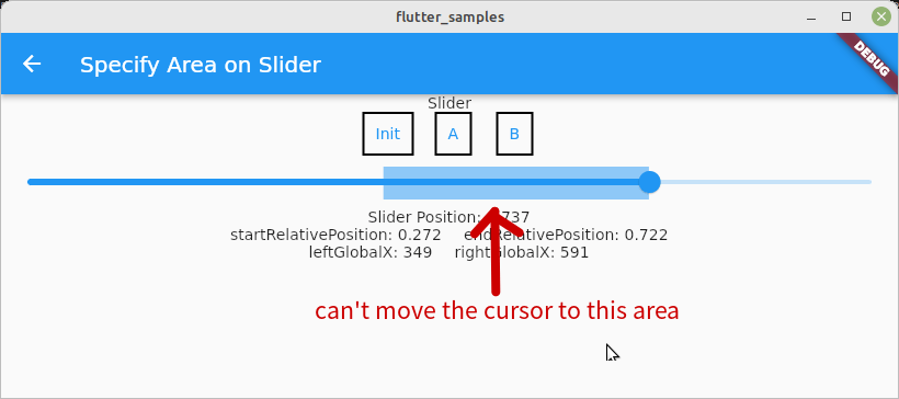
Adjust slider padding space
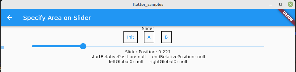
I found this bug after writing the article. Look at the following images. The selected area is not on the slider when the slider position is near to start or end.
This is because the slider widget has padding. I checked the slider code in GitHub.
const double _kPadding = 8.0; // <---- padding
const double _kSliderHeight = 2.0 * (CupertinoThumbPainter.radius + _kPadding);
const double _kSliderWidth = 176.0;
const Duration _kDiscreteTransitionDuration = Duration(milliseconds: 500);
...


  double get _trackLeft => _kPadding; // <---- padding
  double get _trackRight => size.width - _kPadding; // <---- padding
  double get _thumbCenter {
    final double visualPosition;
    switch (textDirection) {
      case TextDirection.rtl:
        visualPosition = 1.0 - _value;
        break;
      case TextDirection.ltr:
        visualPosition = _value;
        break;
    }
    // padding CupertinoThumbPainter.radius is 14
    return lerpDouble(_trackLeft + CupertinoThumbPainter.radius, _trackRight - CupertinoThumbPainter.radius, visualPosition)!;
  }

@override
void paint(PaintingContext context, Offset offset) {
...
  // drawing here
  if (visualPosition > 0.0) {
    final Paint paint = Paint()..color = rightColor;
    canvas.drawRRect(RRect.fromLTRBXY(trackLeft, trackTop, trackActive, trackBottom, 1.0, 1.0), paint);
  }
...
Padding _kPadding = 8.0 and CupertinoThumbPainter.radius = 14 is used for both right and left. Therefore, we need to adjust it. Let’s adjust sliderWidth first.
  double get sliderWidth {
    final renderBox = keyForSlider.currentContext?.findRenderObject() as RenderBox;
    return renderBox.size.width - (14 + 8) * 2;
  }
I don’t want to add the adjustment everywhere, so I introduce getter and setter. Change the name of xxxxGlobalX.
double? _leftGlobalX;
double? _rightGlobalX;
Then, add getter and setter.
void set leftGlobalX(double? value) {
  if (value != null) {
    _leftGlobalX = value + 22;
  } else {
    _leftGlobalX = null;
  }
}

double? get leftGlobalX => _leftGlobalX;

void set rightGlobalX(double? value) {
  if (value != null) {
    _rightGlobalX = value + 22;
  } else {
    _rightGlobalX = null;
  }
}

double? get rightGlobalX => _rightGlobalX;
In this way, we don’t have to change another place.
The adjustment works very well. The selected area starts from the center of the slider.
Change Slider padding value
If the slider padding value needs to be changed, define SliderTheme. If padding is not necessary, set SliderComponentShape.noThumb or SliderComponentShape.noOverlay to overlayShape. If more control is needed, define custom TrackShape.
final sliderTheme = SliderTheme(
  data: SliderThemeData(
    // overlayShape: SliderComponentShape.noThumb,
    // overlayShape: SliderComponentShape.noOverlay,
    trackShape: CustomTrackShape(),
  ),
  child: slider,
);
This is the code. The value 100 is the padding value here. It’s multiplied for trackWidth because the padding needs to be applied both left and right side.
class CustomTrackShape extends RoundedRectSliderTrackShape {
  @override
  Rect getPreferredRect({
    required RenderBox parentBox,
    Offset offset = Offset.zero,
    required SliderThemeData sliderTheme,
    bool isEnabled = false,
    bool isDiscrete = false,
  }) {
    final trackHeight = sliderTheme.trackHeight;
    final trackLeft = offset.dx + 100;
    final trackTop = offset.dy + (parentBox.size.height - trackHeight!) / 2;
    final trackWidth = parentBox.size.width - 100 * 2;
    return Rect.fromLTWH(trackLeft, trackTop, trackWidth, trackHeight);
  }
}
100 is big enough to show the apparent result.
Adjust the area when the window size changes
The current implementation doesn’t adjust the selected area when the window size changes. If this feature is used on a desktop, it must be adjusted correctly.
First of all, we have to get the window size change event. It is implemented in WidgetsBindingObserver. Let’s add it to the widget.
class _SpecifyAreaOnSliderState extends State<SpecifyAreaOnSlider> with WidgetsBindingObserver {
  @override
  void initState() {
    super.initState();
    WidgetsBinding.instance.addObserver(this);
  }

  @override
  void dispose() {
    WidgetsBinding.instance.removeObserver(this);
    super.dispose();
  }
Then, we can handle the event.
@override
void didChangeMetrics() {
  if (_leftGlobalX != null && _rightGlobalX == null) {
    setState(() {
      leftGlobalX = startRelativePosition! * sliderWidth;
      selectedAreaWidth = sliderWidth * (1 - startRelativePosition!);
    });
  } else if (_leftGlobalX == null && _rightGlobalX != null) {
    setState(() {
      rightGlobalX = endRelativePosition! * sliderWidth;
      selectedAreaWidth = _rightGlobalX!;
    });
  } else if (_leftGlobalX != null && _rightGlobalX != null) {
    setState(() {
      leftGlobalX = startRelativePosition! * sliderWidth;
      rightGlobalX = endRelativePosition! * sliderWidth;
      selectedAreaWidth = _rightGlobalX! - leftGlobalX!;
    });
  }
}
setState should be used only for the data change. It should not include other calculations. Therefore, I wrote it in the way above.
We can see that the selected area follows the window size.
Comments