Many apps have a drawer that appears from the left side of the screen. Let’s learn how to implement it in Flutter.
Minimal code
The base code of the view is as follows. To add a drawer, we need to set a widget to drawer property in Scaffold widget. We add the code for drawer into _drawer function.
import 'package:flutter/cupertino.dart';
import 'package:flutter/material.dart';
class DrawerSample extends StatelessWidget {
@override
Widget build(BuildContext context) {
return SafeArea(
child: Scaffold(
drawer: _drawer(context),
appBar: AppBar(
title: Text("Drawer Sample"),
),
),
);
}
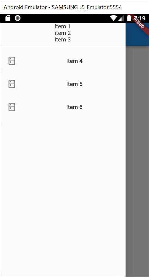
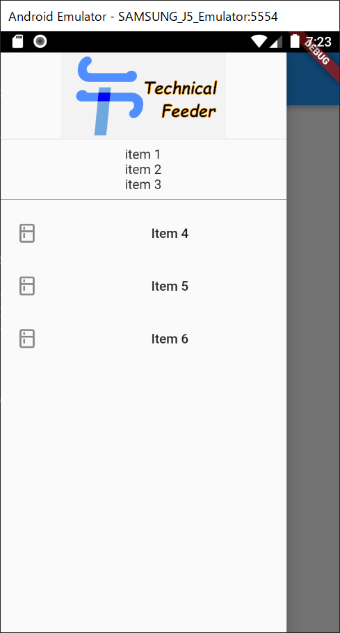
}Normally, the drawer menu shows many items on the screen. Let’s set Drawer that has ListView.
Widget _drawer(BuildContext context) {
  return Drawer(
    child: ListView(
      padding: EdgeInsets.zero,
      children: [
        Center(child: Text("item 1")),
        Center(child: Text("item 2")),
        Center(child: Text("item 3")),
        Divider(color: Colors.black87),
        _generateItem(context, "Item 4"),
        _generateItem(context, "Item 5"),
        _generateItem(context, "Item 6"),
      ],
    ),
  );
}
It looks like this.
Add a header to a drawer
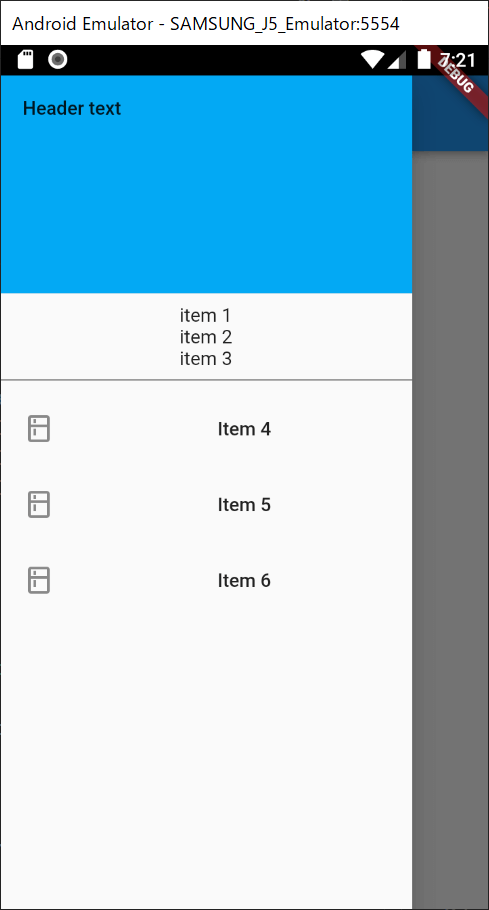
The minimal code is too simple. We definitely want to add a header to tell what the screen is. We might be able to create our own header widget but Flutter offers DrawerHeader widget for it. Let’s use it.
Widget _drawer(BuildContext context) {
  final header = DrawerHeader(
    decoration: BoxDecoration(color: Colors.lightBlue),
    child: Text("Header text"),
  );
  return Drawer(
    child: ListView(
      padding: EdgeInsets.zero,
      children: [
        header,
        Center(child: Text("item 1")),
        Center(child: Text("item 2")),
        Center(child: Text("item 3")),
        Divider(color: Colors.black87),
        _generateItem(context, "Item 4"),
        _generateItem(context, "Item 5"),
        _generateItem(context, "Item 6"),
      ],
    ),
  );
}

Widget _generateItem(BuildContext context, String title) {
  return ListTile(
    title: Center(child: Text(title)),
    leading: Icon(Icons.kitchen),
  );
}
It looks like this.
The header box is too big by default. It’s better to wrap it.
Widget _drawer(BuildContext context) {
  final header = DrawerHeader(
    decoration: BoxDecoration(color: Colors.lightBlue),
    // Center widget is added
    child: Center(child: Text("Header text")),
  );
  return Drawer(
    child: ListView(
      padding: EdgeInsets.zero,
      children: [
        // wrap the header
        Container(
          child: header,
          height: 100,
        ),
       ...
      ],
    ),
  );
}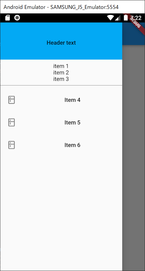
It looks smarter.
Use an image in DrawerHeader
There are some cases that we want to use an image on the header. We can use an image in the following way.
final header = DrawerHeader(
  decoration: BoxDecoration(
    image: DecorationImage(
      fit: BoxFit.scaleDown,
      image: AssetImage("./lib/resources/logo_1200_630.jpg"),
    ),
  ),
  child: SizedBox.shrink(),
);
But I tried to run the code, the following error occurred.
════════ Exception caught by image resource service ════════════════════════════
The following assertion was thrown resolving an image codec:
Unable to load asset: ./lib/resources/logo_1200_630.png

When the exception was thrown, this was the stack
This error occurs even if the image exists in the right place. To solve this error, we need to add the path to pubspec.yaml. The description tells us where we need to add it.
flutter:
  # To add assets to your application, add an assets section, like this:
  assets:
    - lib/resources/logo_1200_630.jpg
    #   - images/a_dot_ham.jpeg
After pubspec.yaml is updated, a flutter command is automatically executed and the image can be used in our application.
The logo image is shown in the header. When an image is used, we might not want to have child widget in the DrawerHeader. Set SizedBox.shrink() in this case.
final header = DrawerHeader(
  decoration: BoxDecoration(
    image: DecorationImage(
      fit: BoxFit.scaleDown,
      image: AssetImage("./lib/resources/logo_1200_630.jpg"),
    ),
  ),
  child: SizedBox.shrink(),
);
BoxFit enum has several options. Find a proper one from the enum. We can easily choose it because the code IntelliSense shows example images.
Change the widget width
The drawer width is large by default, isn’t it? If we want to change the width, FractionallySizedBox is useful.
return SafeArea(
  child: Scaffold(
    drawer: FractionallySizedBox(
      child: _drawer(context),
      widthFactor: 0.5,
    ),
    ...
It calculates the screen width and shows the widget with the specified rate.
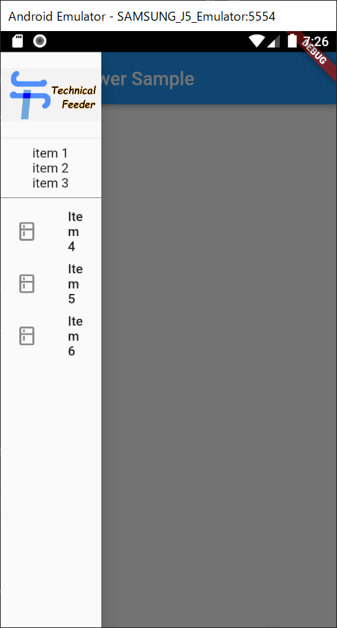
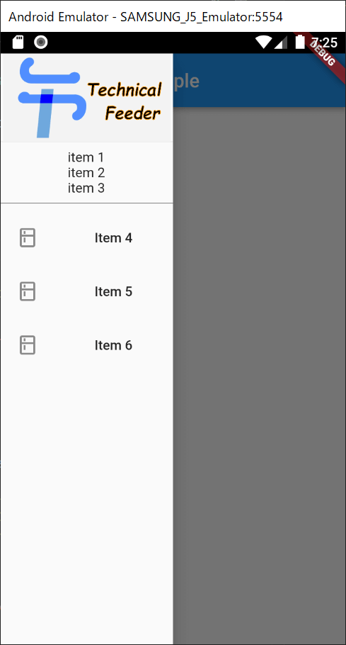
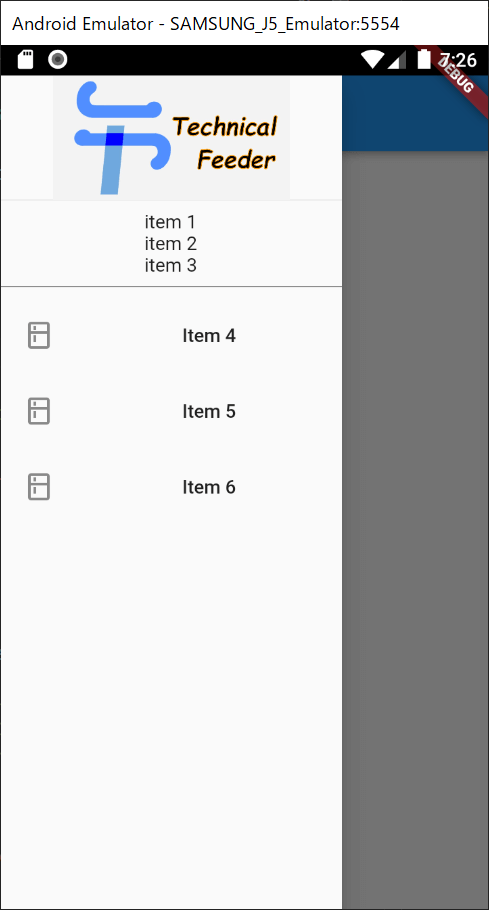
The following images are when widthFactor is 0.3, 0.5 and 0.7.
Move from the drawer menu to another page
I prepared the following simple page.
class _NextView extends StatelessWidget {
  @override
  Widget build(BuildContext context) {
    return SafeArea(
      child: Scaffold(
        appBar: AppBar(
          title: Text("Empty page"),
        ),
      ),
    );
  }
}
I think a drawer is used to move to another page. We should know how to write it. Navigator can be used to move a page.
Widget _generateItem(BuildContext context, String title) {
  return ListTile(
    title: Center(child: Text(title)),
    onTap: () {
      Navigator.push(
        context,
        MaterialPageRoute(builder: (context) => _NextView()),
      );
    },
    leading: Icon(Icons.kitchen),
  );
}
When the back button is pressed on the Empty Page, the drawer menu is still shown there. If we want to go back to the root screen, we should call push function with await and call pop.
Widget _generateItem(BuildContext context, String title) {
  return ListTile(
    title: Center(child: Text(title)),
    onTap: () async {
      // await here
      await Navigator.push(
        context,
        MaterialPageRoute(builder: (context) => _NextView()),
      );
      // call pop
      Navigator.pop(context);
    },
    leading: Icon(Icons.kitchen),
  );
}
Disable Drag Gesture to open drawer
Drag gesture is enabled by default. It means the drawer is shown when we drag from the left side to the right side.
If we want to disable it, set false to drawerEnableOpenDragGesture property.
@override
Widget build(BuildContext context) {
  return SafeArea(
    child: Scaffold(
      // drawer: _drawer(context),
      drawer: FractionallySizedBox(
        child: _drawer(context),
        widthFactor: 0.5,
      ),
      drawerEnableOpenDragGesture: false,
      appBar: AppBar(
        title: Text("Drawer Sample"),
      ),
    ),
  );
}
Place drawer on the right side
It’s very easy to do it! Set our Drawer to endDrawer property.
@override
Widget build(BuildContext context) {
  return SafeArea(
    child: Scaffold(
      // instead of drawer
      endDrawer: FractionallySizedBox(
        child: _drawer(context),
        widthFactor: 0.5,
      ),
      appBar: AppBar(
        title: Text("Drawer Sample"),
      ),
    ),
  );
}
Comments